How to Build Interactive Network Graph in D3.js
In my last blog post, I walked through a network link chart example in sigma.js. In this post, I’ll do the same for a network link chart that is built using another popular data visualization library: d3.js. The syntax may be different, but the core concepts are the same. In my opinion, D3 is the better choice for building link charts with force directed layouts and node movement. However, Sigma was much easier to work with and probably has less of a learning curve for new developers. Due to its ease of use, I think Sigma has more customizable features and I have come to prefer it to D3’s link chart capabilities. Nevertheless, it is worth learning D3, so here is an example of a network link chart built using D3.
Now I will break it down piece by piece…
Unlike Sigma, there is only 1 required library to import:
<script src="js/d3.min.js"></script>The CSS is a lot heavier than Sigma though:
.all_links {
stroke: #999;
stroke-opacity: 0.7;
}
.all_nodes {
stroke: #fff;
stroke-width: 1.5px;
}
.domain {
fill: none;
stroke: #000;
stroke-opacity: .3;
stroke-width: 10px;
stroke-linecap: round;
}
.halo {
fill: none;
stroke: #ddd;
stroke-width: 8px;
stroke-linecap: round;
}
.tick {
font-size: 12px;
}
.selecting circle {
fill-opacity: .2;
}
.selecting circle.selected {
stroke: #f00;
}
.handle {
fill: #fff;
stroke: #000;
stroke-opacity: .5;
stroke-width: 1.25px;
cursor: pointer;
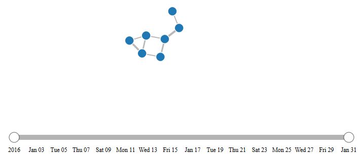
}The visualization is again inserted into the div with id=network_graph. The code starts after the <script> tag. The first 3 segments are fairly straight forward. They set the height and width of the SVG element (the link chart is rendered as SVG instead of an image, so that it scales seamlessly), the color scale, and the start and end dates for the time slider. The time slider is an optional add-on, but I included it because it is useful for dynamic network analysis, or looking at changes in the links of a network over time.
//Specify pixel height and width for SVG element
var width = 800;
var height = 600;
var padding = 20;

//Specify a color scale
var color = d3.scale.category20();

//Specify start and end dates for time scale - note that January is 0 and December is 11
var startdt = new Date(2016, 0, 1);
var enddt = new Date(2016, 0, 31);
The next 3 segments are also fairly easy to follow. The first sets up the force directed layout. Unlike Sigma’s force atlas algorithm, which converges on an optimized layout, the force layout in D3 continuously runs in the background, which means that every time a node is dragged, the force layout reestablishes a new position. The concept is similar to Sigma’s force atlas however: nodes are pushed the maximum distance apart while maintaining closeness in terms of connections. So nodes with many of the same connections appear closer together than nodes with very different connections. In the layout, charge is a variable that determines the spread of the nodes, much like a shot grouping pattern. Large negative numbers spread the nodes far apart. The section following the layout is standard D3 – it appends a SVG element to the network_graph div element. Right now the SVG is an “empty” object, but it will soon be bound to data. The last section below creates the tooltips that appear when a node is hovered over. Most of that code block is just the CSS for the tooltip, created as SVG object properties.
//Set up the force directed graph layout
var force = d3.layout.force()
	.charge(-120)
	.linkDistance(30)
	.size([width, height]);

//Append SVG element to the network_graph div
var netg = d3.select("#network_graph").append("svg")
	.attr("width", width)
	.attr("height", height);

//Create tooltips to display on hover
var tooltip = d3.select("body")
	.append("div")
	.style("position", "absolute")
	.style("z-index", "10")
	.style("visibility", "hidden")
	.style("color", "white")
	.style("padding", "8px")
	.style("background-color", "rgba(0, 0, 0, 0.75)")
	.style("border-radius", "6px")
	.style("font", "12px sans-serif")
	.text("tooltip");
The section below sets a D3 time scale, and translates the boundaries of the scale to the start and end dates defined previously. The x-axis is then defined using the scale, a tick size, and padding between tick marks on the axis.
//Create time scale that translates start date to left of screen and end date to right
var xscale = d3.time.scale()
	.domain([startdt, enddt])
	.range([padding, width - 6*padding])
	.clamp(true);

//Define the x-axis (the time scale)
var xAxis = d3.svg.axis()
	.scale(xscale)
	.tickSize(0)
	.tickPadding(20);
The next part of the code is a bit of a monster, but it handles the bulk of the creation of the network’s SVG elements. First the JSON data is read into D3 and stored as ‘netdata’. Then the date range for the dataset is discovered by parsing the data using the getDate() function. Note that d is used as the argument to the getDate function, and it will be used in other functions further down, because it is D3’s generic abbreviation for data. The code then loops through the links in the dataset and pulls the event_date (the date on which 2 nodes first connected) for each link. The min and the max become the range for the time slider later on. The force layout is then initiated, passing the nodes and links from netdata as the inputs. At this point, nothing has been created as an SVG. The next line starts the process by appending link SVG elements and binding the link data to them. The link thickness set as a function of the weight of a connection. Next, the nodes are created. The node color is set to the group or cluster, which in this case is the same for every node, but building the code this way allows for the possibility of coloring nodes by cluster. The mouse over methods are tied to the nodes so that the tooltips defined above appear on hover. There is also a method for double-clicking on a node, which focuses on that node and its connections. When the node is dragged, there is a call to the force layout, which re-optimizes the network’s layout after the node is dragged somewhere. The dragging ability is enabled by the SVG brush element, which is handily implemented by a D3 function. The next 2 blocks create the time slider along the x-axis, and the circles at each end of the slider. The properties appended to them are for style (translate moves the position of the slider to a certain location). The section after the slider creation calculates the screen coordinates for all of the nodes. The x, y coordinates and circle size are all calculated here. There are 2 sets of x, y coordinates because the coordinates are also used to determine the position of the links, and the start/end points for each link are the centers of the nodes. Lastly, there is a collide function that prevents nodes from overlapping.
//Read the network data from JSON file
d3.json("data/test_w_dates.json", function (error, netdata) {

	if (error) {
		throw error;
	}

	//Establish date range for dataset
	function getDate(d) {
		return d3.time.format("%d-%b-%Y").parse(d);
	}
	var all_dates = [];
	for (var i in netdata.links) {
		//alert(getDate(netdata.links[i].event_date));
		all_dates.push(getDate(netdata.links[i].event_date));
	}
	var minDate = d3.min(all_dates);
	var maxDate = d3.max(all_dates);

	//Create the graph data structure out of the JSON data
	force.nodes(netdata.nodes)
		.links(netdata.links)
		.start();

	//Create all the links (the line SVGs), but without locations specified for drawing them yet
	var link = netg.selectAll(".link")
		.data(netdata.links)
		.enter().append("line")
		.attr("class", "all_links")
		//Make the link thickness a function of the link value (the weight of a connection)
		.style("stroke-width", function (d) {
			return Math.sqrt(d.value)+1;
		});

	//Create all the nodes (the circle SVGs), but without locations specified for drawing them yet
	var node = netg.selectAll(".node")
		.data(netdata.nodes)
		.enter().append("circle")
		.attr("class", "all_nodes")
		.attr("r", 9)
		//Make the node color a function of the node's group (the node's cluster)
		.style("fill", function (d) {
			return color(d.group);
		})
		.call(force.drag)
		.on("mouseover", function(d) {
			tooltip.text(d.name);
			tooltip.style("visibility", "visible");
		})
		.on("mousemove", function() {
			return tooltip.style("top", (d3.event.pageY-10)+"px").style("left",(d3.event.pageX+10)+"px");
		})
		.on("mouseout",  function() {
			return tooltip.style("visibility", "hidden");
		})
		.on('dblclick', connectedNodes);  //Implements focus on double-clicked node's network (connectedNodes function)

	//SVG brush is an element that allows the user to click/drag to select something
	var brush = d3.svg.brush()
		.x(xscale)
		.extent([startdt, enddt])
		.on("brush", brushed);

	//Append an SVG element for the brush/time slider, create SVG axis, append slider element
	var slidercontainer = netg.append("g")
		.attr("transform", "translate(100, 500)");
	var axis = slidercontainer.append("g")
		.call(xAxis);
	var slider = slidercontainer.append("g")
		.call(brush)
		.classed("slider", true);

	//Append slider handles (circles at the ends of the slider)
	d3.selectAll(".resize").append("circle")
		.attr("cx", 0)
		.attr("cy", 0)
		.attr("r", 10)
		.attr("fill", "Red")
		.classed("handle", true);

	//Use the force layout to calculate the coordinates for all for all of the SVG elements (circles and lines)
	force.on("tick", function () {
		link.attr("x1", function (d) {
				return d.source.x;
			})
			.attr("y1", function (d) {
				return d.source.y;
			})
			.attr("x2", function (d) {
				return d.target.x;
			})
			.attr("y2", function (d) {
				return d.target.y;
			});
		node.attr("cx", function (d) {
				return d.x;
			})
			.attr("cy", function (d) {
				return d.y;
			});
	});
	node.each(collide(0.5));  //Implements anti-overlapping of the circles (the collide function)
The next function helps determine which nodes and links to remove (gray out) when the slider is moved. If the event_date of a link is greater than the slider value, then the opacity of the link and its associated nodes stays as it is, otherwise it is dropped to 0, which will make them all disappear.
	//Define brushed function to add and remove links based on what the user selects in the brush element
	function brushed() {
		link.style("stroke-opacity", function(d) {
		   return getDate(d.event_date) > brush.extent()[1] ? 0 : 0.7;
		 });
		force.start();
	}
The functions above are all that would be needed to build a basic network link chart with a time slider in D3. However, I added a few auxiliary functions for more finesse. The first separates the node circles with padding, to prevent any overlap. This function is called collide() and was called when the nodes were created above.
	//Create a function to prevent nodes from overlapping by separating the circles with padding
	var padding = 1;
	var radius=8;
	function collide(alpha) {
		var quadtree = d3.geom.quadtree(netdata.nodes);
		return function(d) {
			var rb = 2*radius + padding;
			var nx1 = d.x - rb;
			var nx2 = d.x + rb;
			var	ny1 = d.y - rb;
			var	ny2 = d.y + rb;
			quadtree.visit(function(quad, x1, y1, x2, y2) {
				if (quad.point && (quad.point !== d)) {
					var x = d.x - quad.point.x;
					var y = d.y - quad.point.y;
					var l = Math.sqrt(x * x + y * y);
					if (l < rb) {
						l = (l - rb) / l * alpha;
						d.x -= x *= l;
						d.y -= y *= l;
						quad.point.x += x;
						quad.point.y += y;
					}
				}
			  return x1 > nx2 || x2 < nx1 || y1 > ny2 || y2 < ny1;
			});
		};
	}
The next section enables the double-click action that was called when the nodes were created. A double-click focuses on one node and its network.
	/*The next code block makes it so that double-clicking shows only the clicked node's network*/
	//Toggle stores whether a node has been double-clicked
	var toggle = 0;
	//Create an array to log which nodes are connected to which other nodes
	var linkedByIndex = {};
	for (i = 0; i < netdata.nodes.length; i++) {
		linkedByIndex[i + "," + i] = 1;
	};
	netdata.links.forEach(function (d) {
		linkedByIndex[d.source.index + "," + d.target.index] = 1;
	});
	//This function looks up whether a pair are neighbors
	function neighboring(a, b) {
		return linkedByIndex[a.index + "," + b.index];
	}
	function connectedNodes() {
		if (toggle == 0) {
			//Reduce the opacity of all but the neighboring nodes
			d = d3.select(this).node().__data__;
			node.style("opacity", function (o) {
				return neighboring(d, o) | neighboring(o, d) ? 1 : 0.1;
			});
			link.style("opacity", function (o) {
				return d.index==o.source.index | d.index==o.target.index ? 1 : 0.1;
			});
			toggle = 1;
		} else {
			//Put them back to opacity=1
			node.style("opacity", 1);
			link.style("opacity", 1);
			toggle = 0;
		}
	}

});
That’s all! It was a bit longer than the Sigma network, and a bit trickier to put together because of the way D3 creates SVG elements before there is any data bound to them, but it works just as well. As you saw, one advantage to D3 is that elements like sliders and other visualizations that use the data can be built in with little extra code. The same can be done for Sigma, but it requires custom JavaScript. In a future blog, I’ll show how an entire dashboard can be created with a Sigma network and other D3 visualizations bound to the same data. In this dashboard, interacting with the D3 visualizations will update the Sigma graph.